Client: KNVB (Royal Dutch Football Association)
Type: Social Visual Identity
Role: Ideation, Brand strategy, Design Direction
Type: Social Visual Identity
Role: Ideation, Brand strategy, Design Direction
Background
The KNVB (Royal Dutch Football Association) is the sporting body that runs football in The Netherlands-this includes the Men's and Women's national teams. It has a fan centric, sub-brand called Ons Oranje, which they invest a lot of resources into, but felt it lacked quality a cohesive visual identity.
The Challenge
Time was against us. The women's World Cup was months away and the men's tournament in just over a year and the run up to and around the national team matches, we want to inspire, inform and activate fans with content that touches their heart. This visual identity would encompass all the facets of live games, pre-and post match reviews and off-field content. How do we do that?
The Solution
I'm big believer that any design language should have it's genesis out the logo. The Lion and Lioness on the badge became a potent symbol to unite fans under and what was cool was zooming in to any part of the emblems would give you instant brand recognition and enormous flexibility in creating a modern and radical new social brand identity.
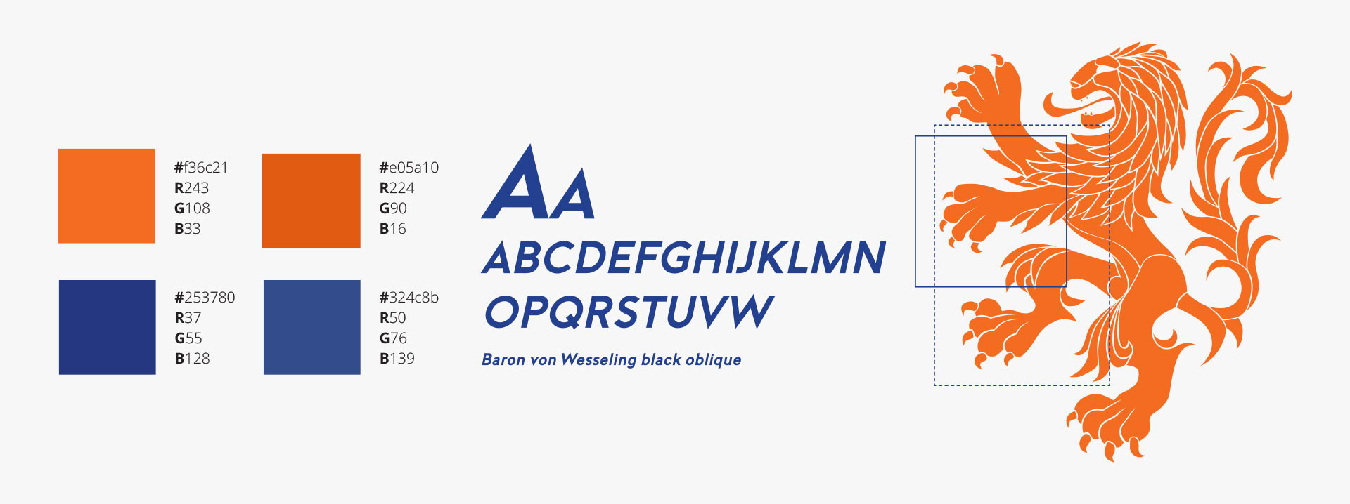
Colours, Typography & Graphic elements
Construction
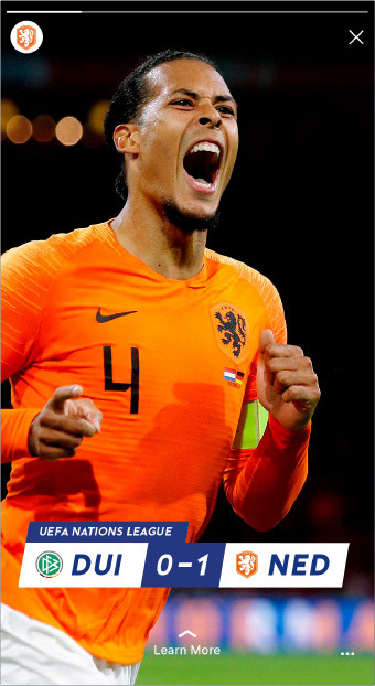
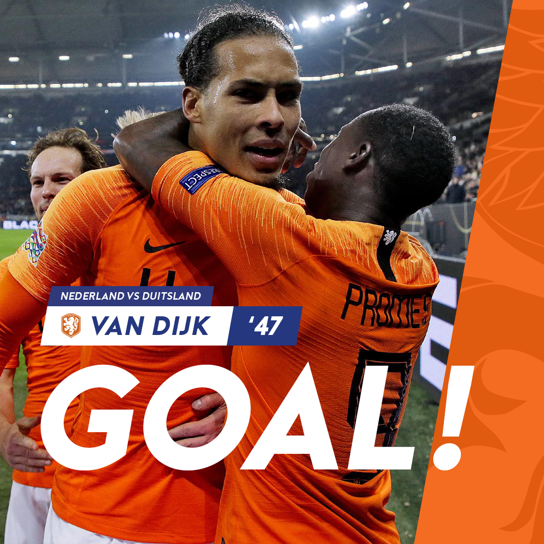
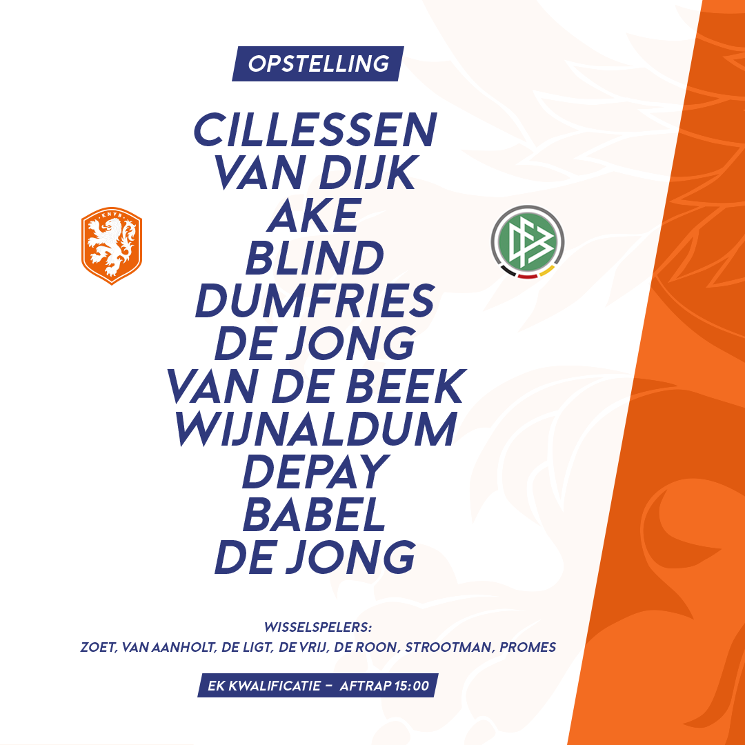
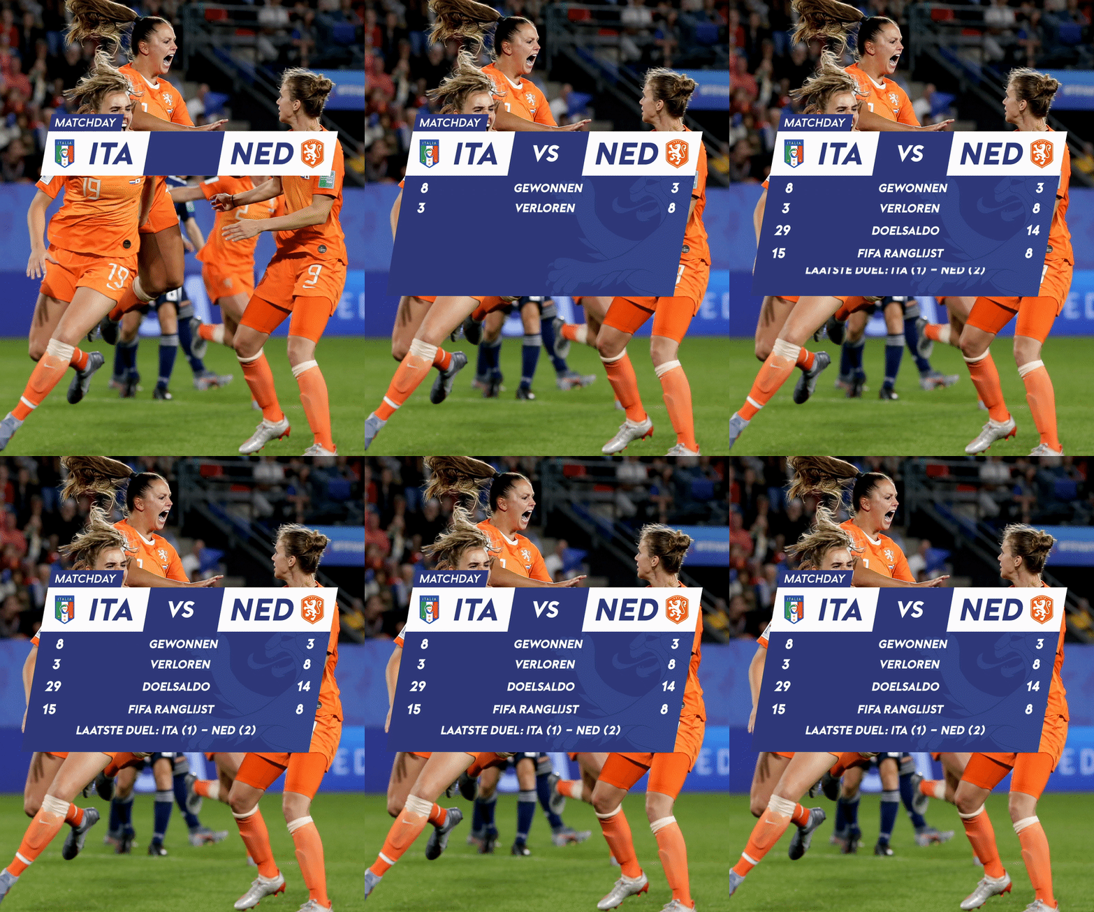
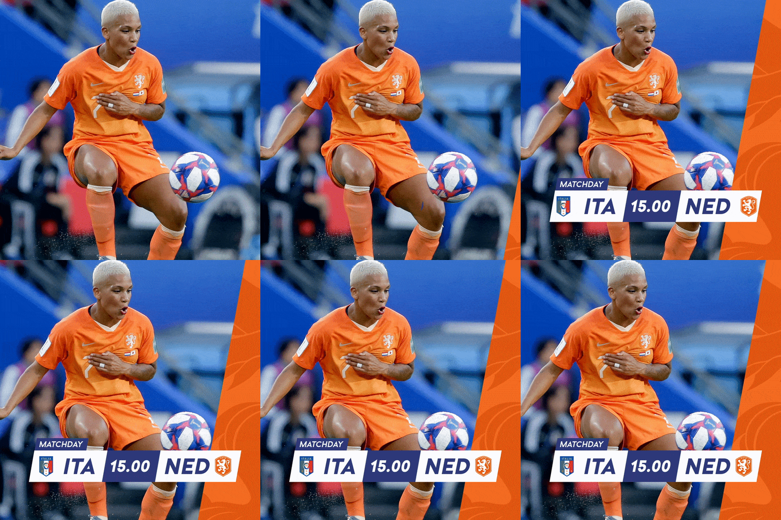
The visual themes still needed to be underscored by a design language and so this idea of "progress" and "movement" became the inspiration for the graphic elements on titles, in-match graphics, match day statistics, touch screens and OHH.
Photography
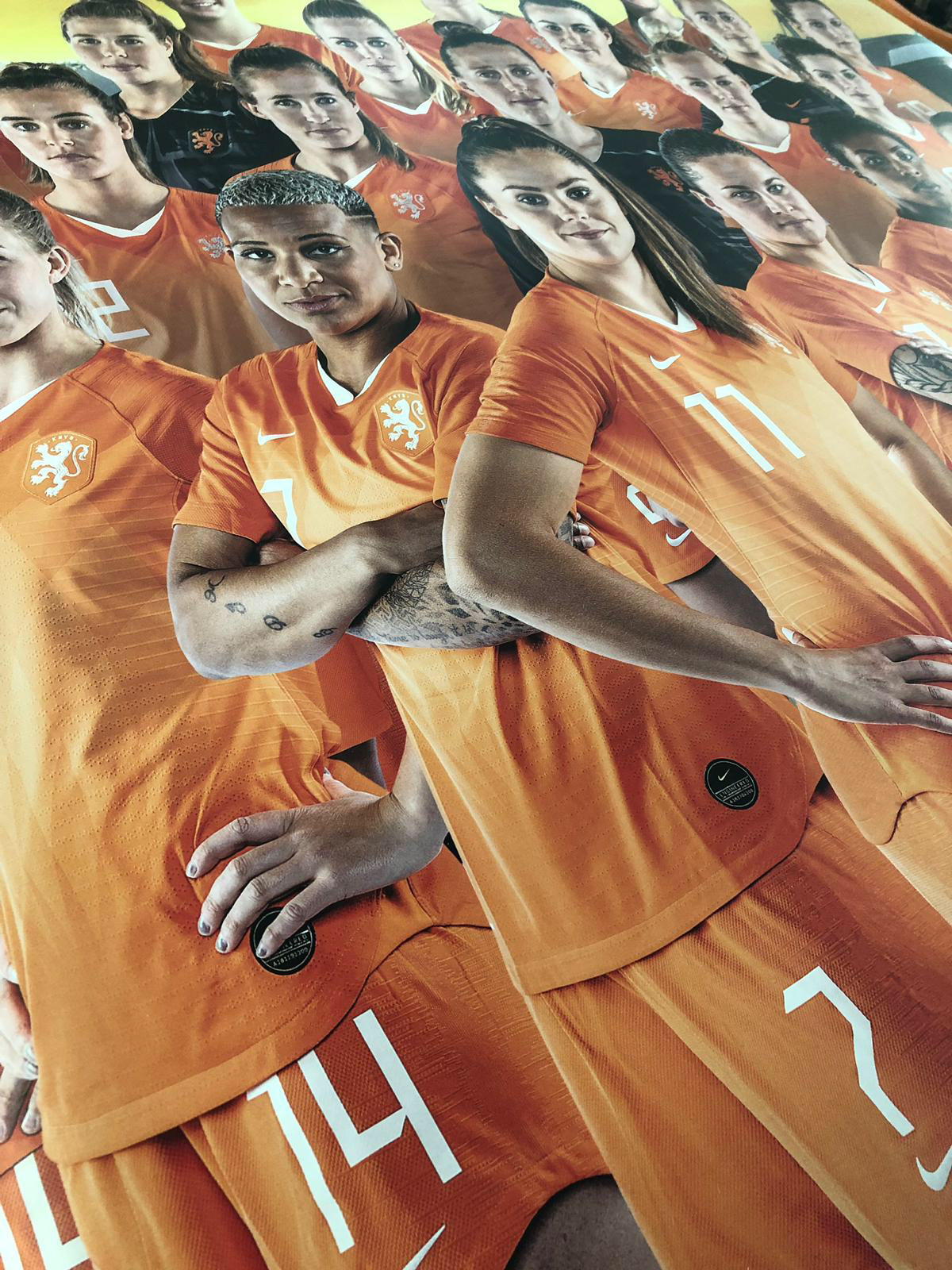
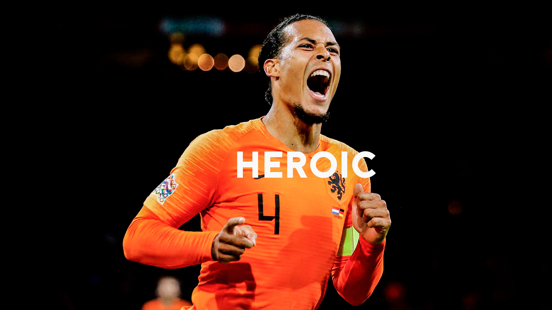
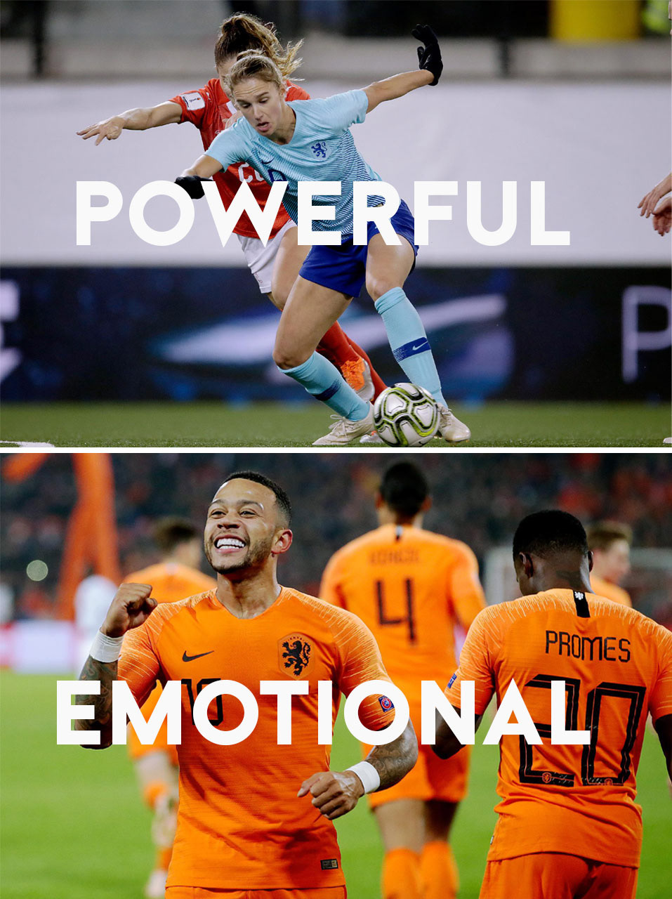
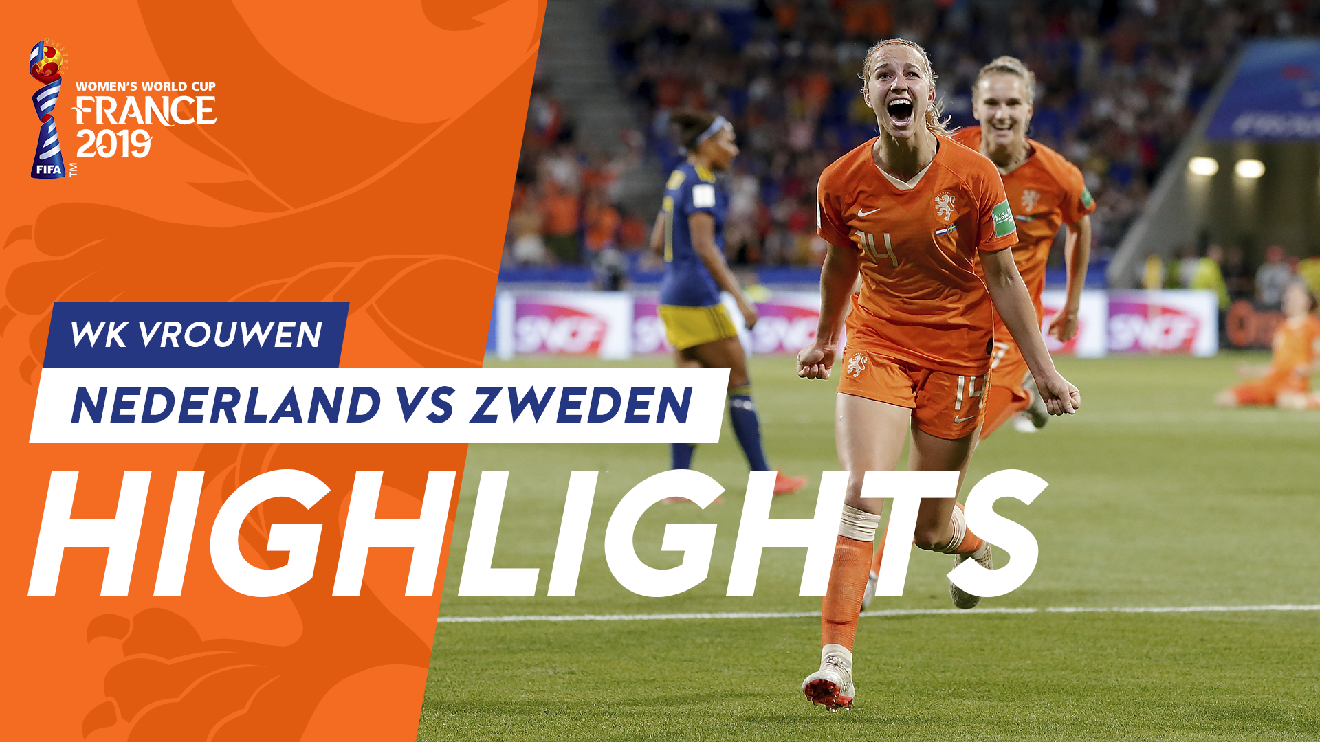
Football is an intense and emotional game and photography is essential to telling the story of Oranje. We were fortunate to have access to a great image library of the men's and women's teams. Our lions and lionesses are heroes an so too the images are heroic, emotional and powerful an the poses players strike in photography, must reflect this.
Assets
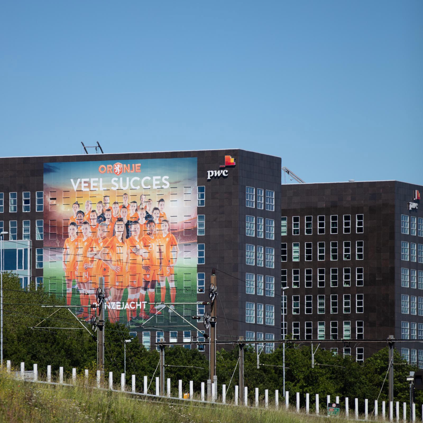
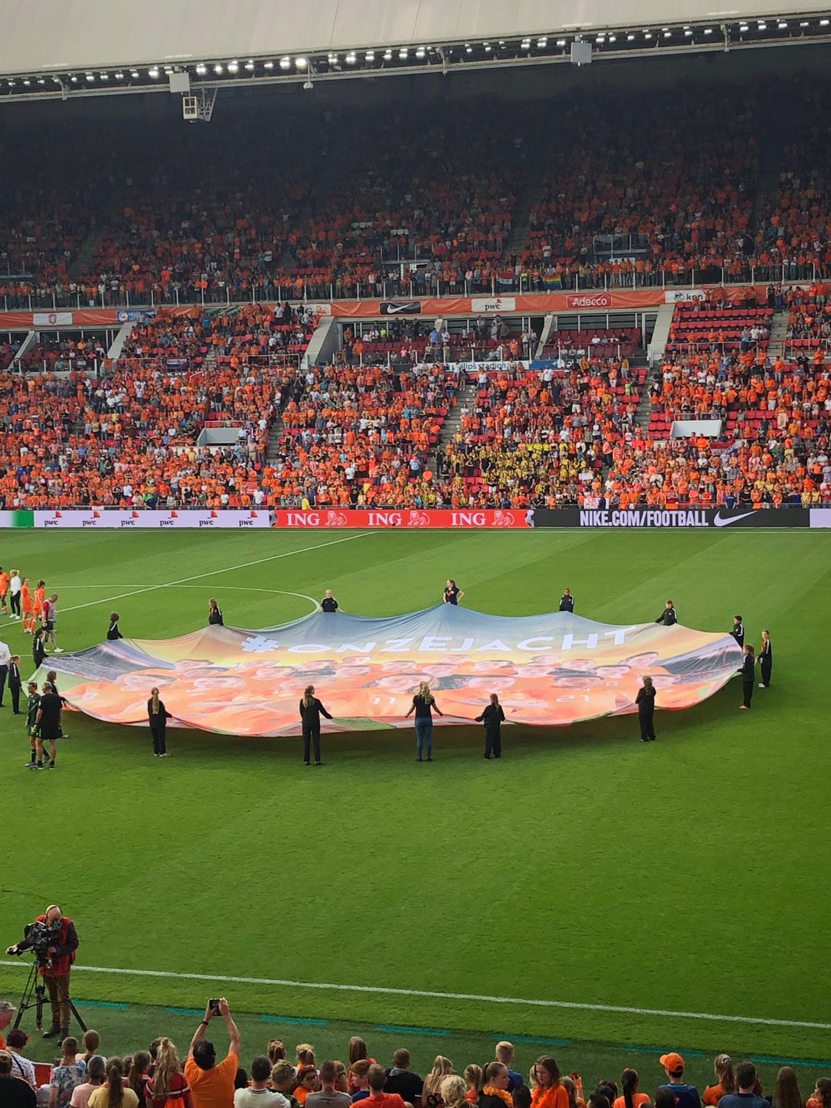
Promotional
