Client: Tellent (formerly known as Recruitee)
Type: Hybrid Event Identity
Role: Ideation, Brand strategy, Design Direction,
Type: Hybrid Event Identity
Role: Ideation, Brand strategy, Design Direction,
Background
TGTHR (pronounced together) is Recruitee's go-to event for HR and recruitment professionals. This free, online event brings the benefits of collaborative hiring to the forefront of the HR industry.
The Challenge
We knew we had a compelling message, but the market was flooded with webinars and hybrid events and so the battle for eyeballs and attention so a visually distinct design language was crucial. The second challenge was that an online event like this is a much an exercise in branding, as it is sales, but the brand should not be seen as being shoved it down their throats.
The Solution
Very early on in development I felt that the design language for this event should echo the primary visual identity of Recruitee. Instead of directly lifting all elements from the parent brand, we'd focus key design elements that could give us the scope and flexibility to create from. The shapes and brand colours became the core vehicle to transmit our message
Landing Page
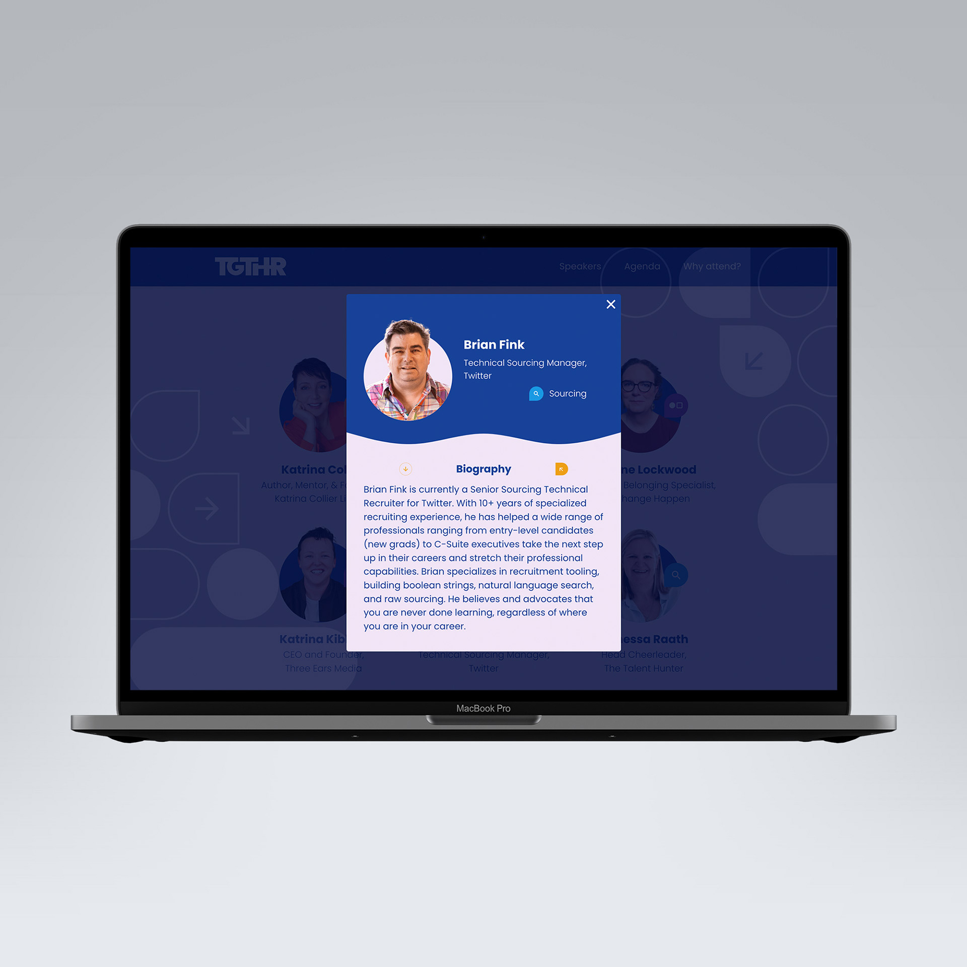
Our primary goal was create awareness, to drive traffic and sign ups, to the event. Our landing page was the main portal where attendees could pre-register, sign up and learn more about the speakers and topics over the two days.
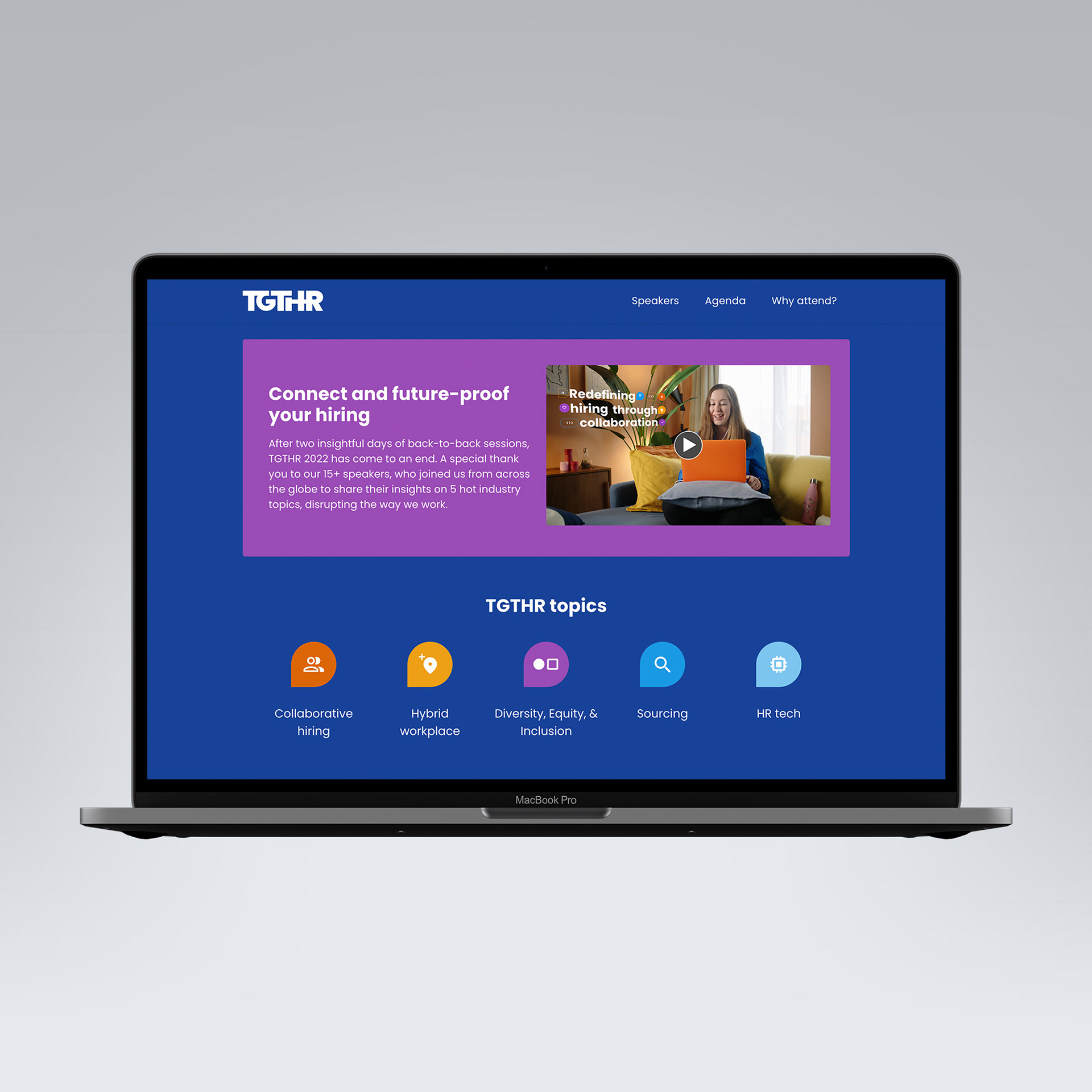
Event Promise & Topics
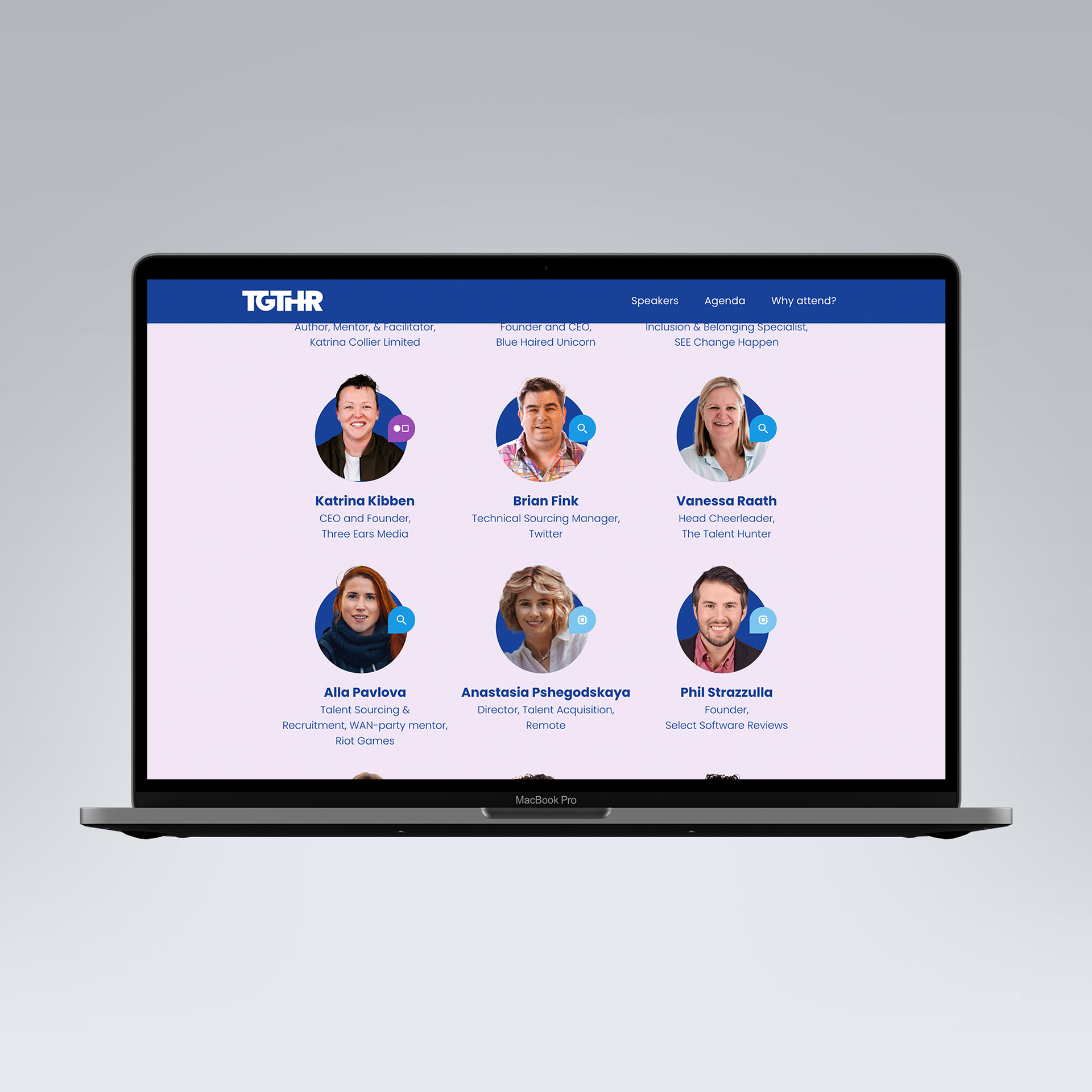
Speaker Lineup
Speaker Bio
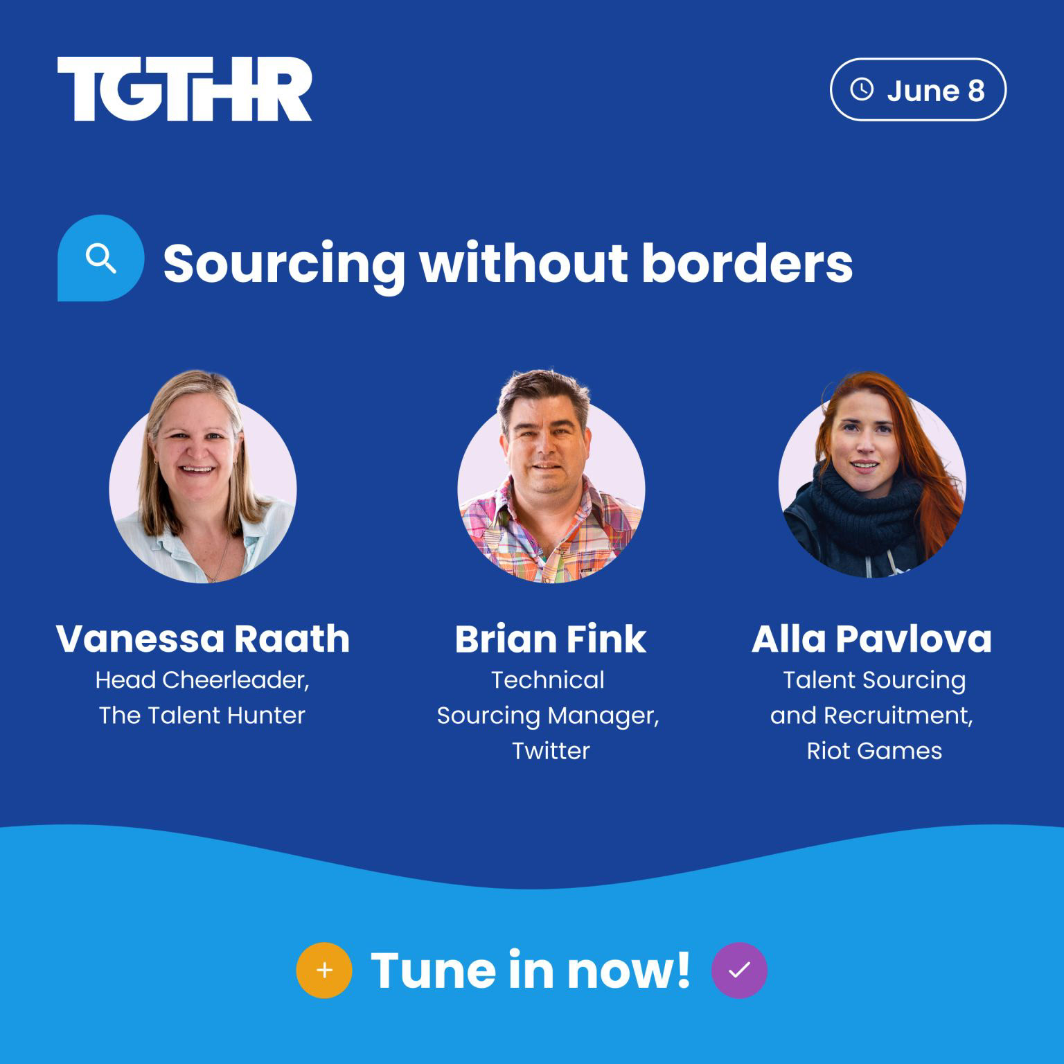
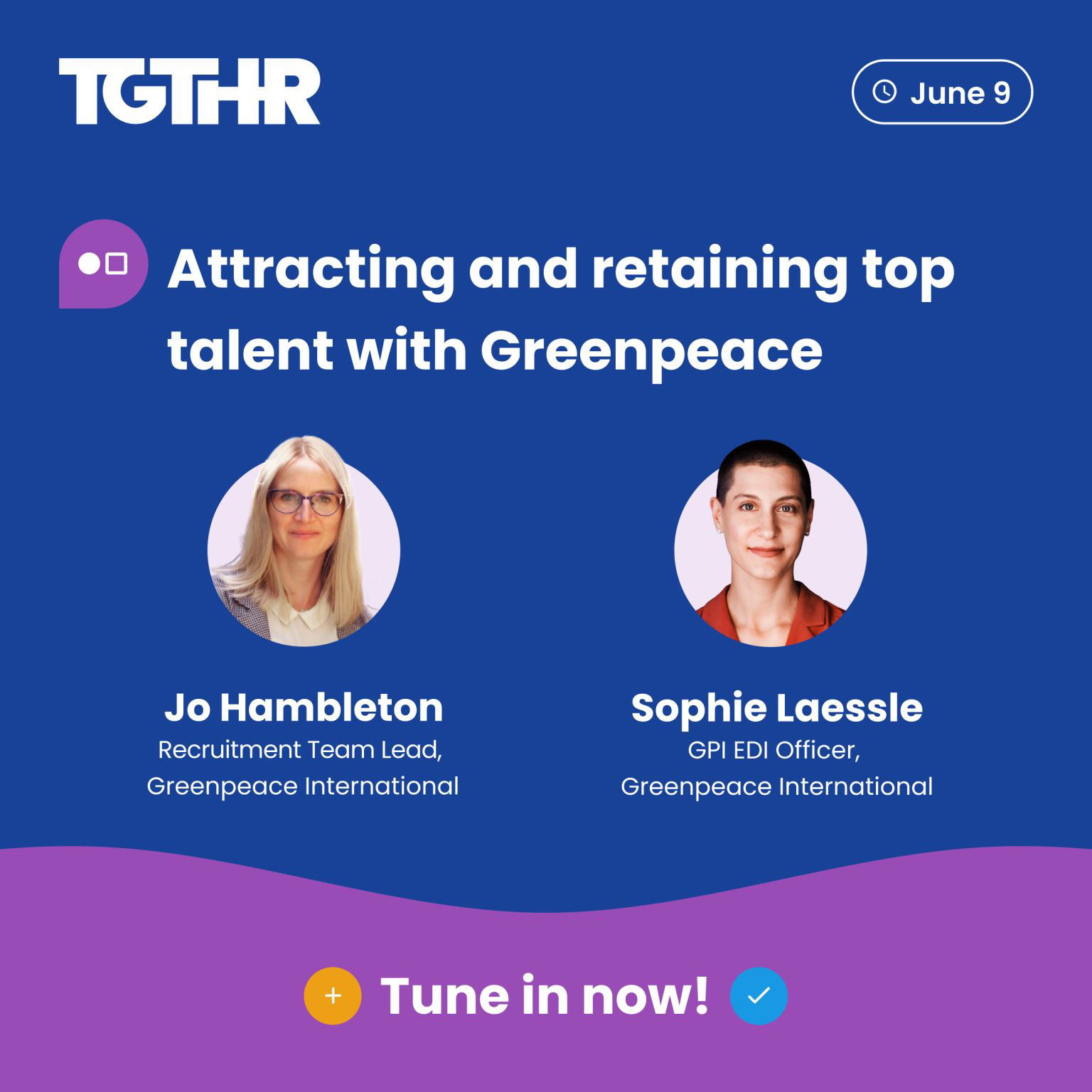
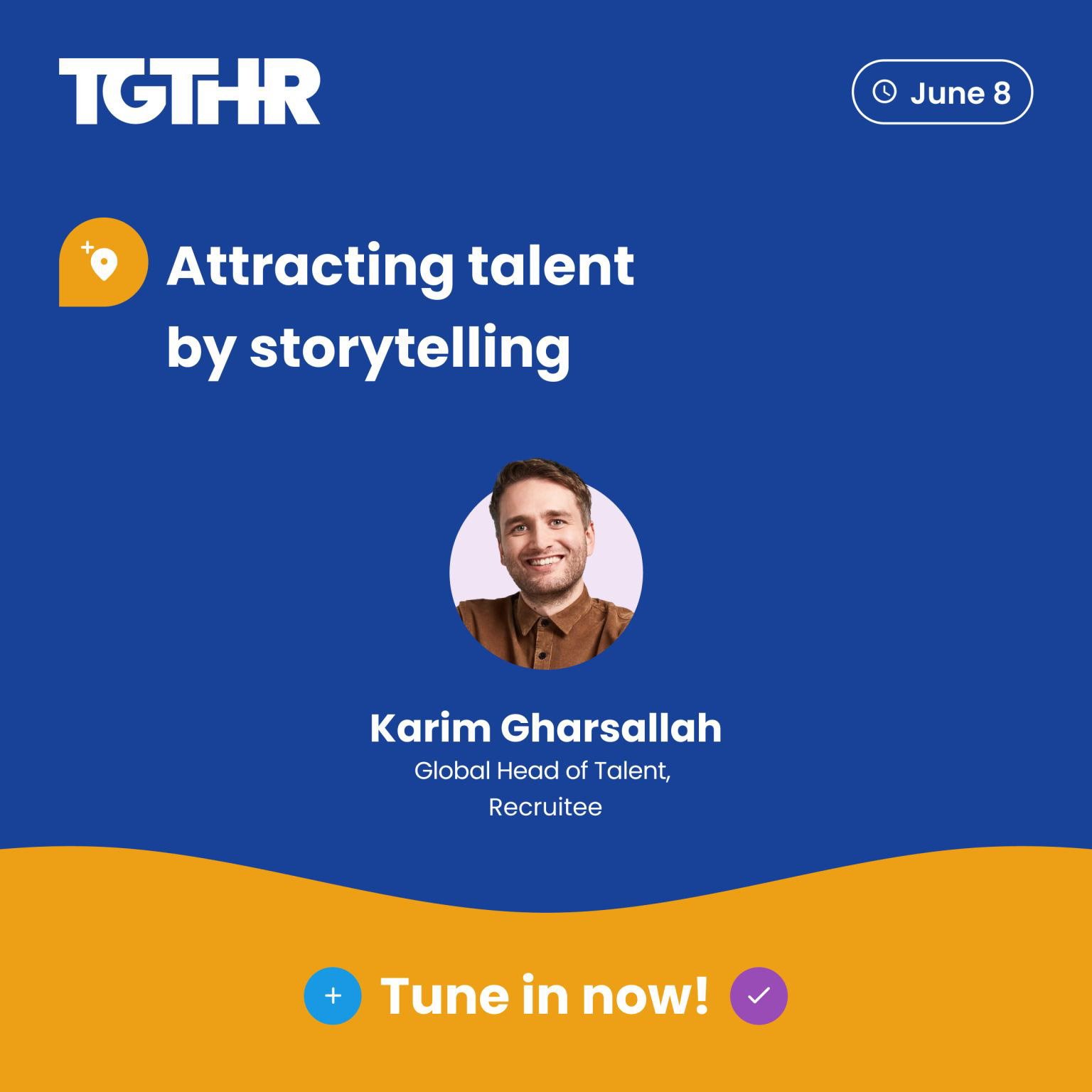
Promotional assets
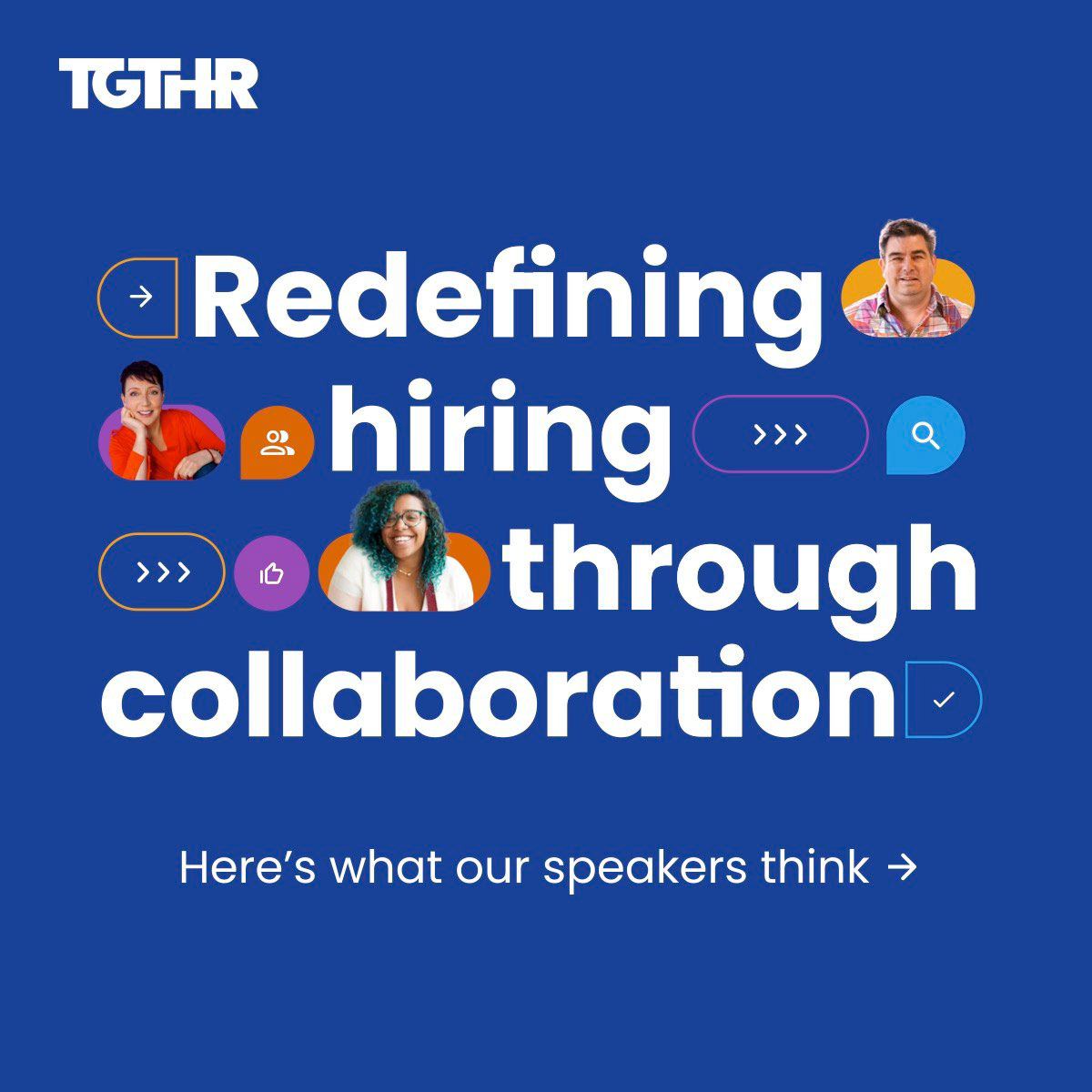
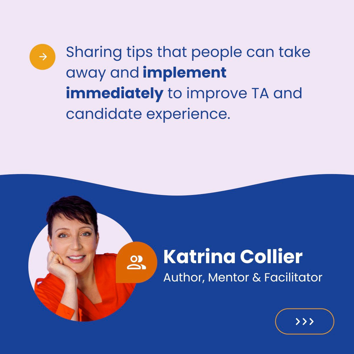
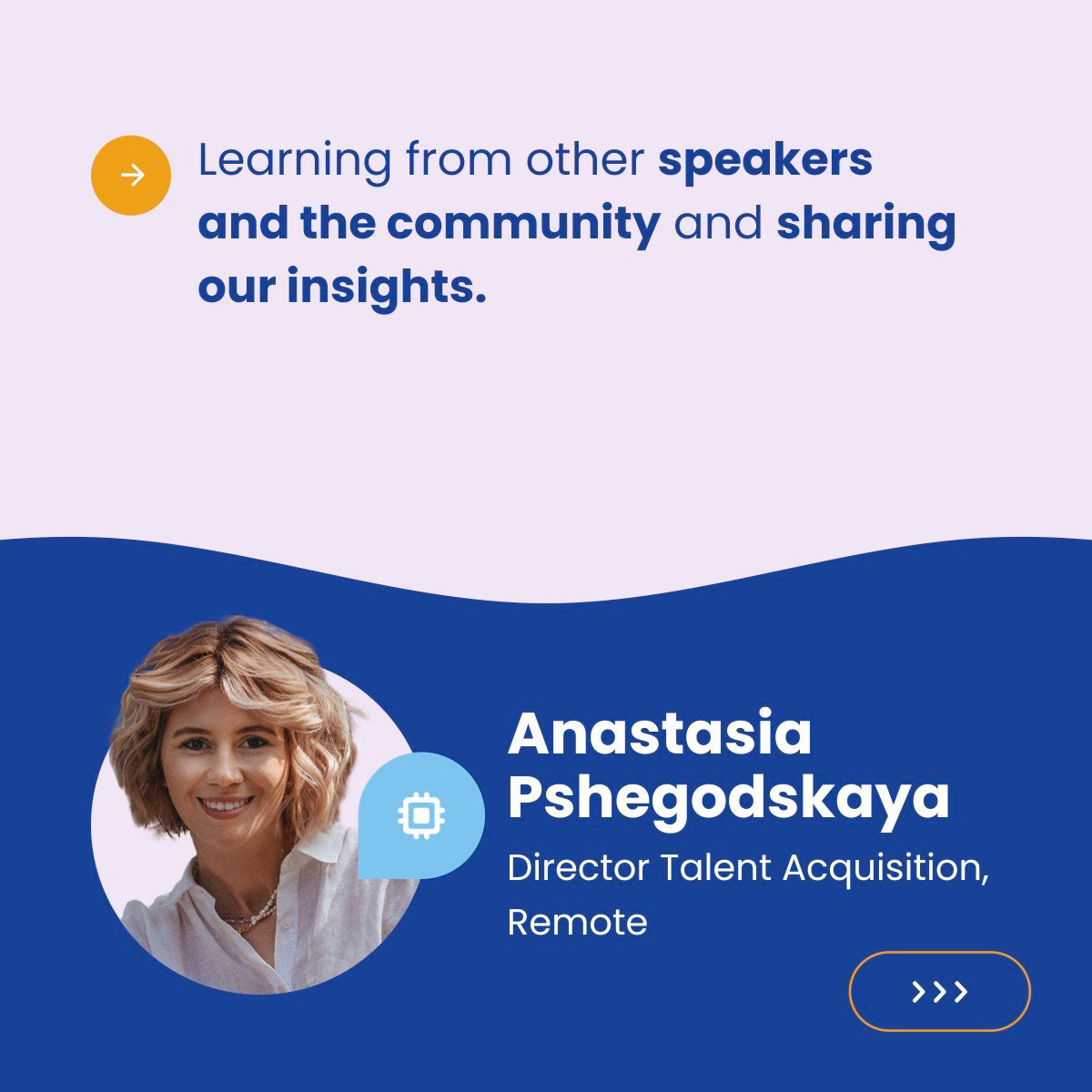
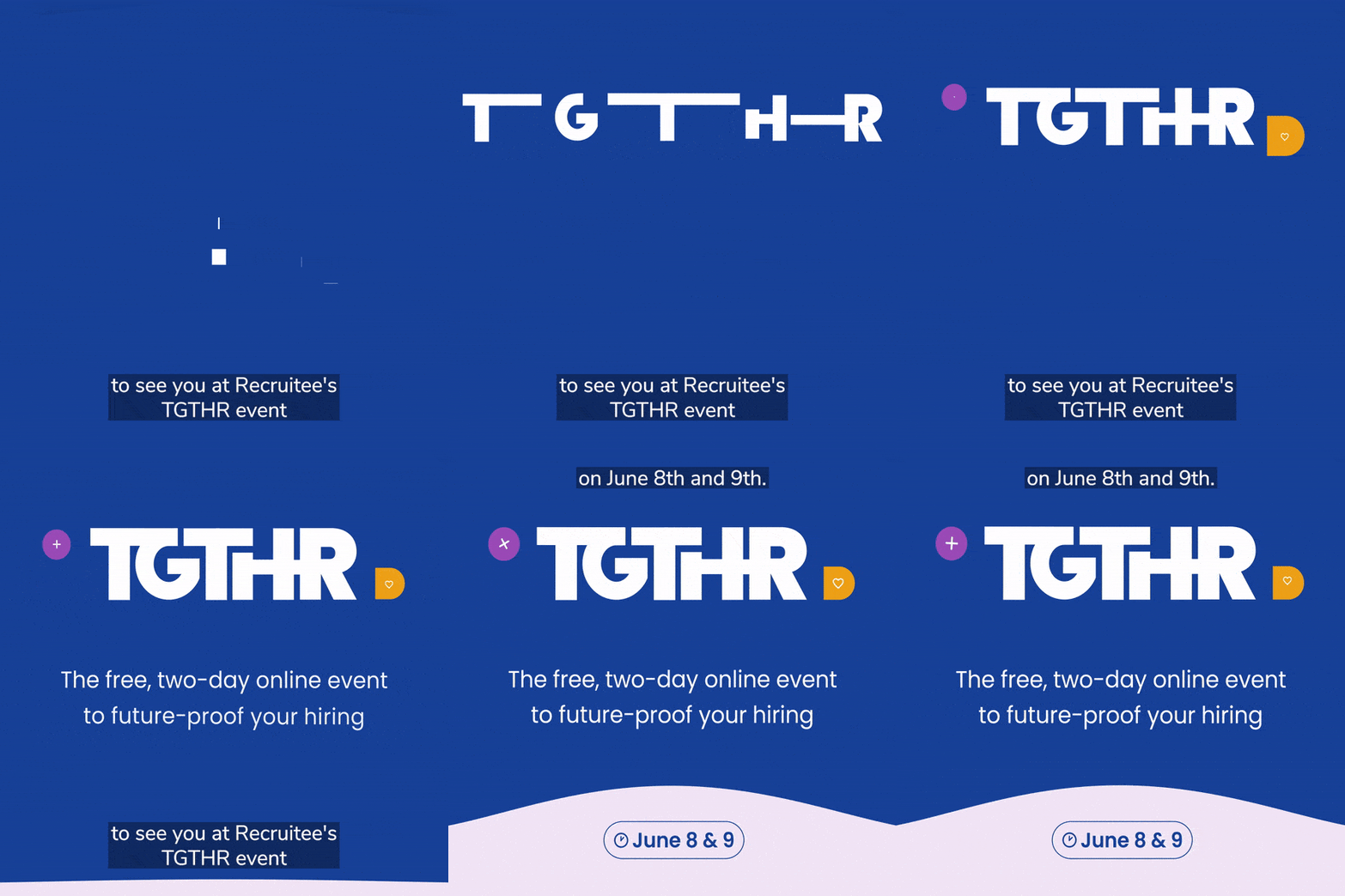
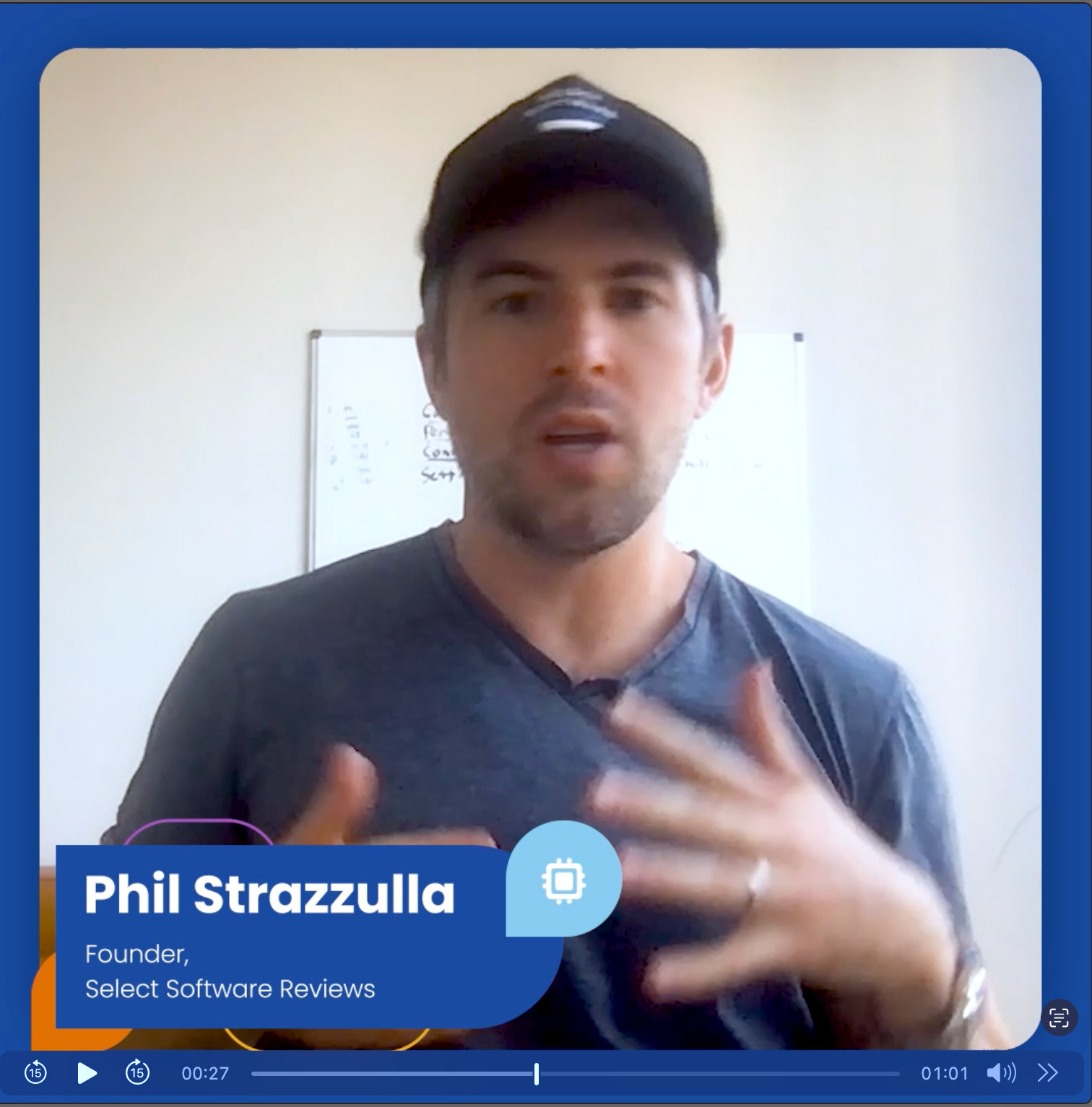
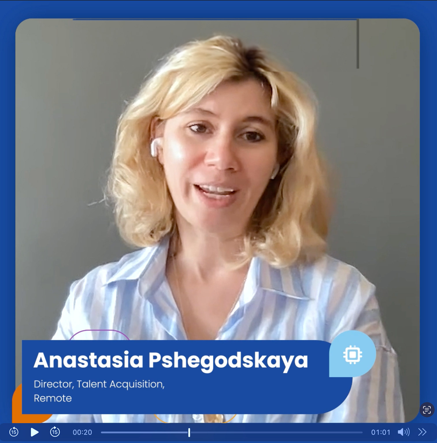
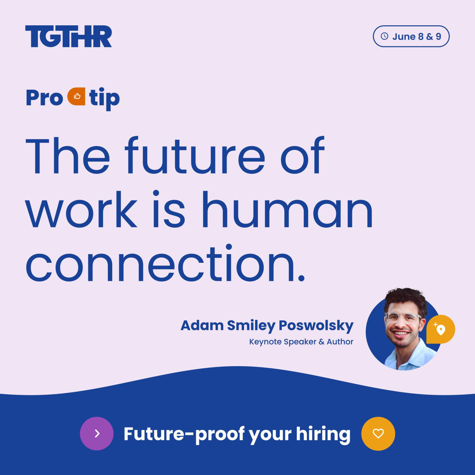
Promotional assets where created for both organic and paid audiences. They ranged from a hype video to create awareness, zero-click social assets to drive signups and share learnings and insights to again drive interests and sign ups to the event
Set design
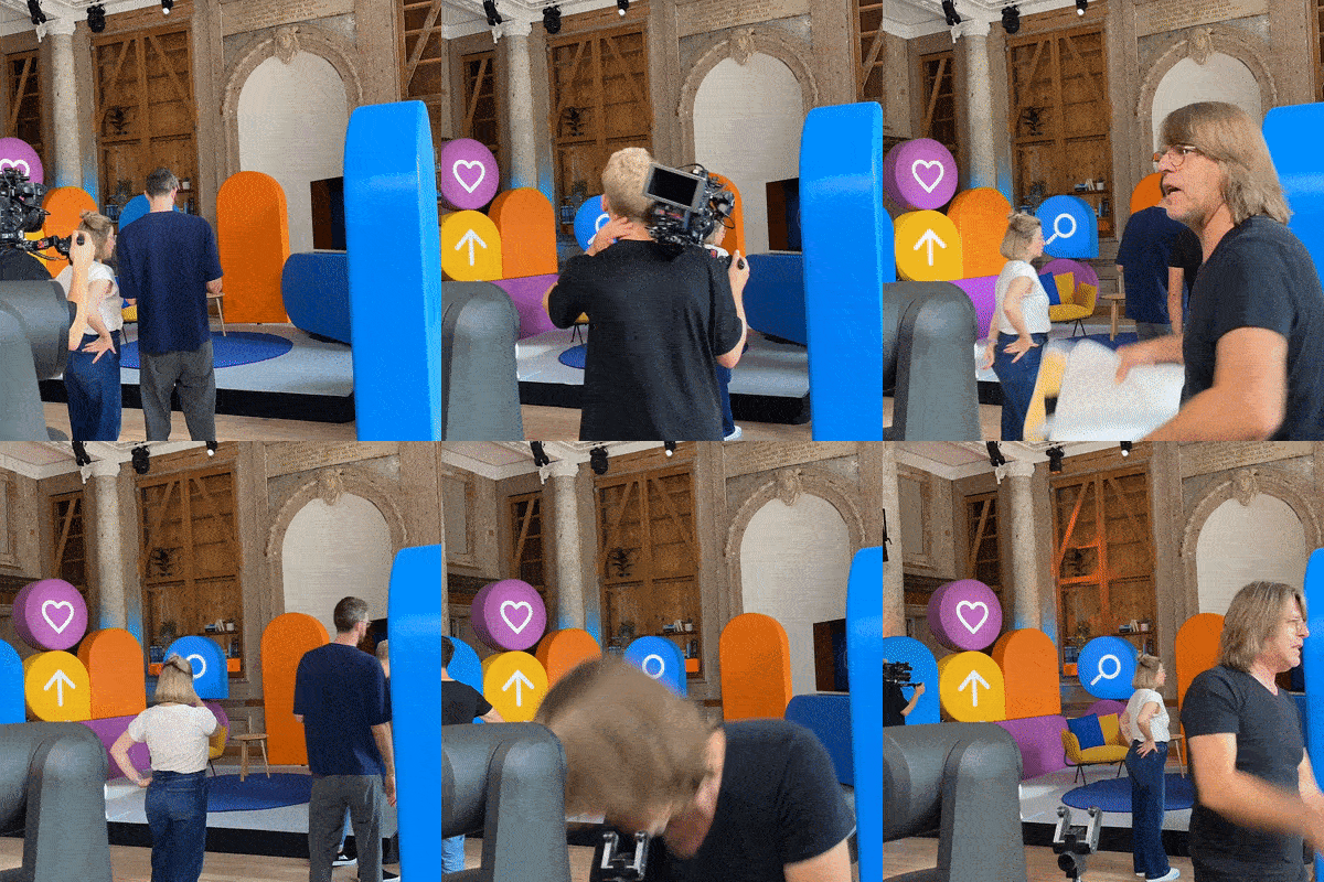
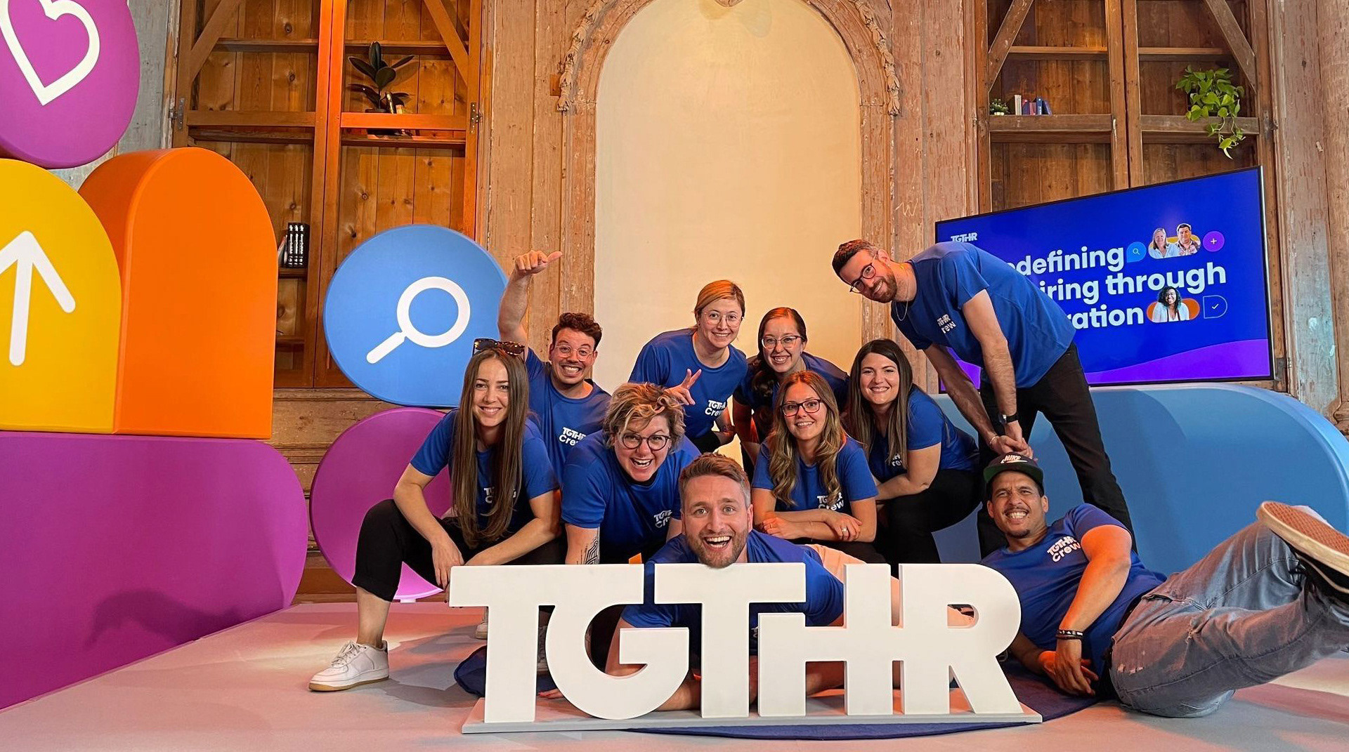
Probably the biggest challenge we had was translating the 2D design language into a three dimensional space. After many over complicated iterations we went back to our design mantra of "simple yet significant". Stripping away the excesses and letting the shapes and colours be visual accents rather than distractions and I couldn't be more pleased with the result.
Probably the biggest challenge we had was translating the 2D design language into a three dimensional space. After many over complicated iterations we went back to our design mantra of "simple yet significant". Stripping away the excesses and letting the shapes and colours be visual accents rather than distractions and I couldn't be more pleased with the result.
